Organic or Designer?
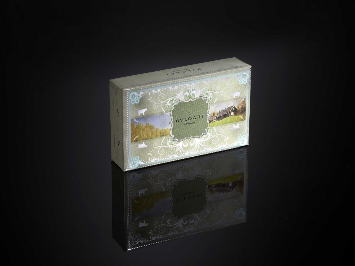
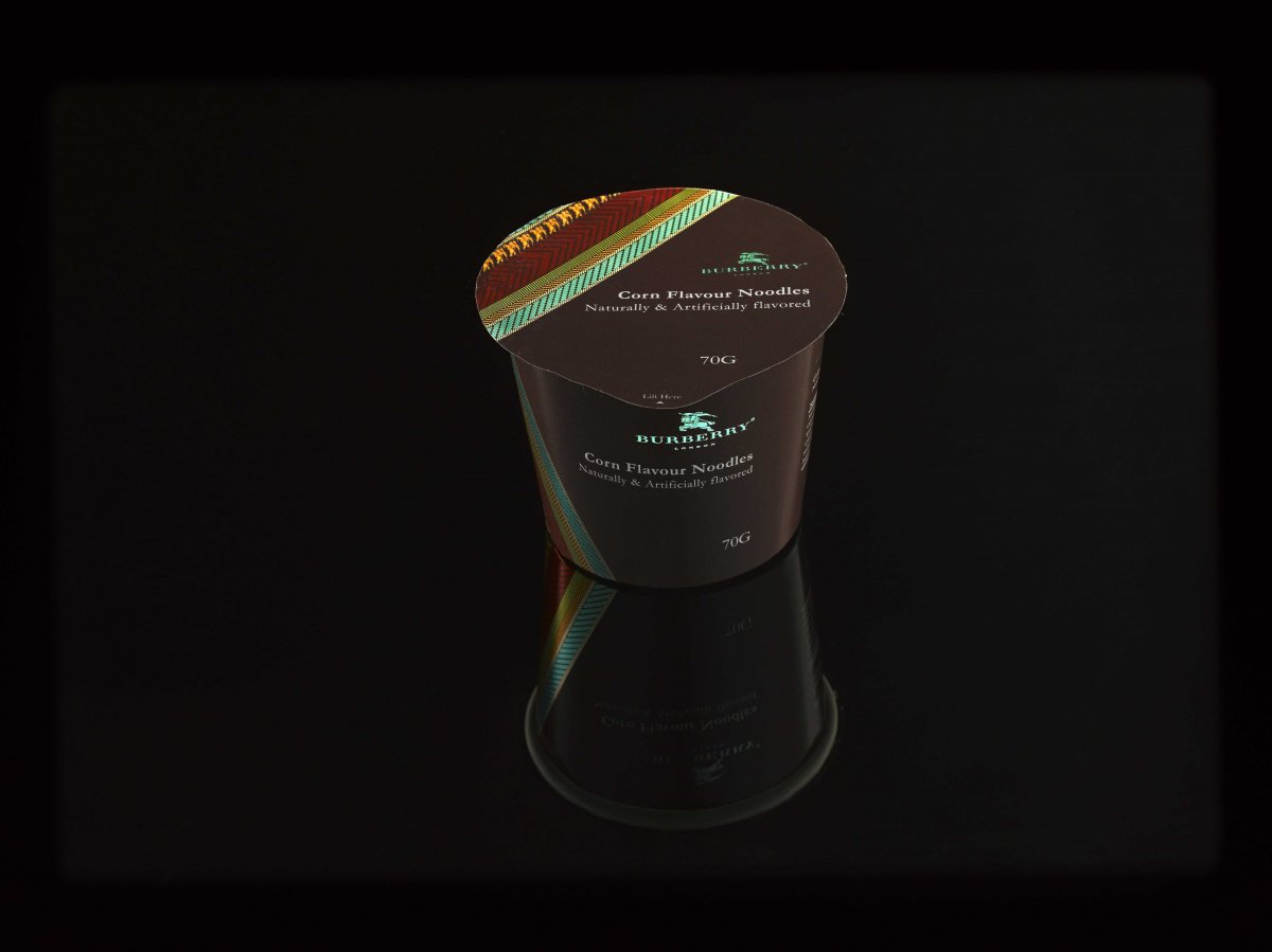
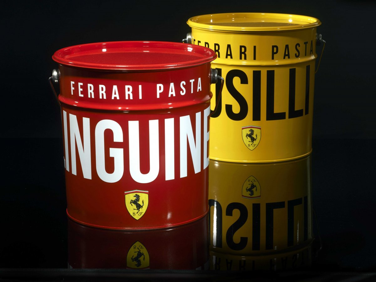
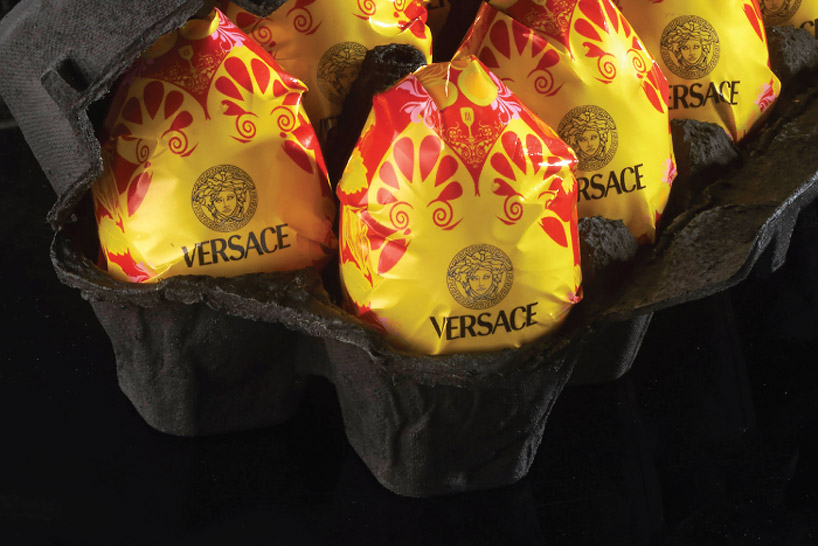
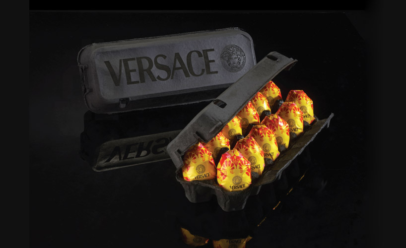
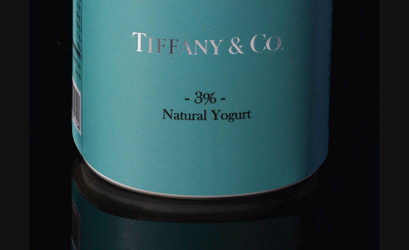
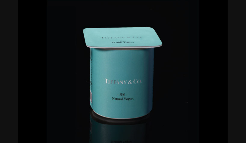
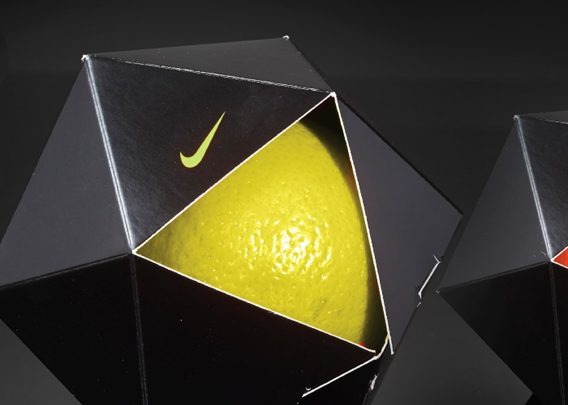
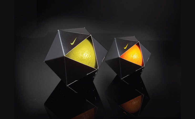
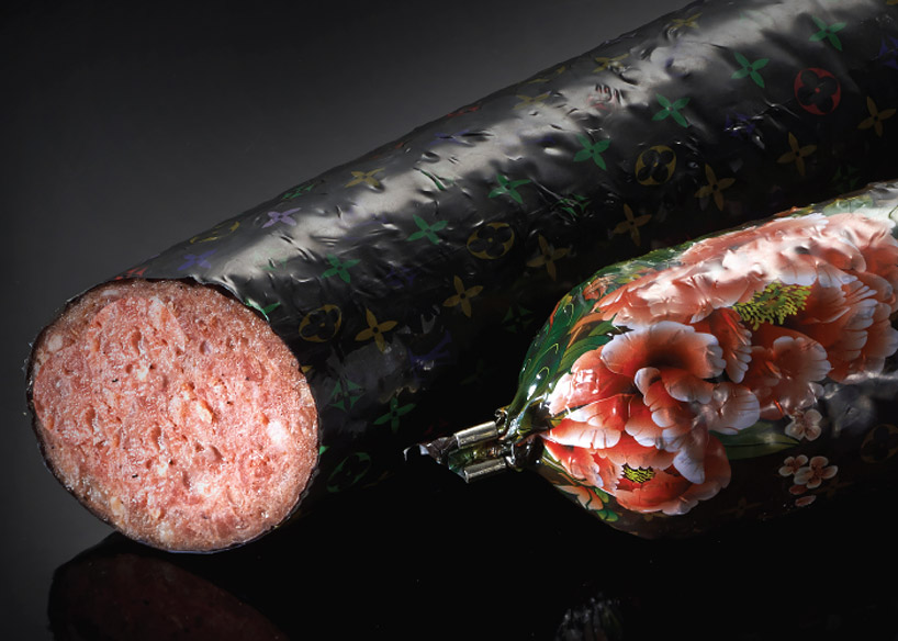
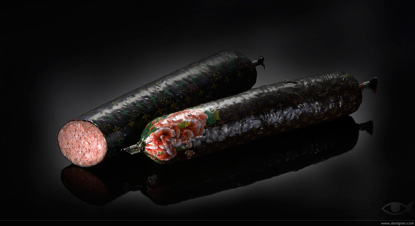
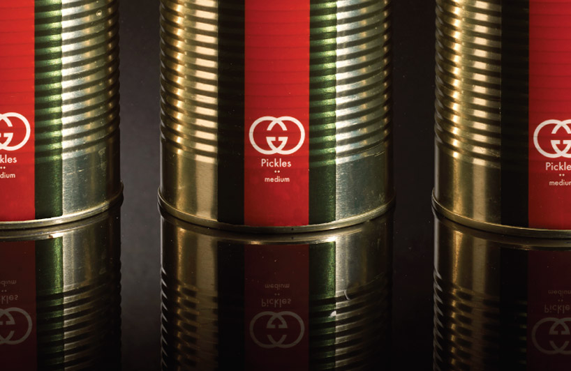
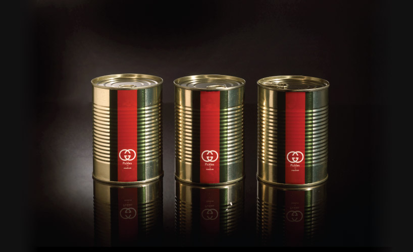
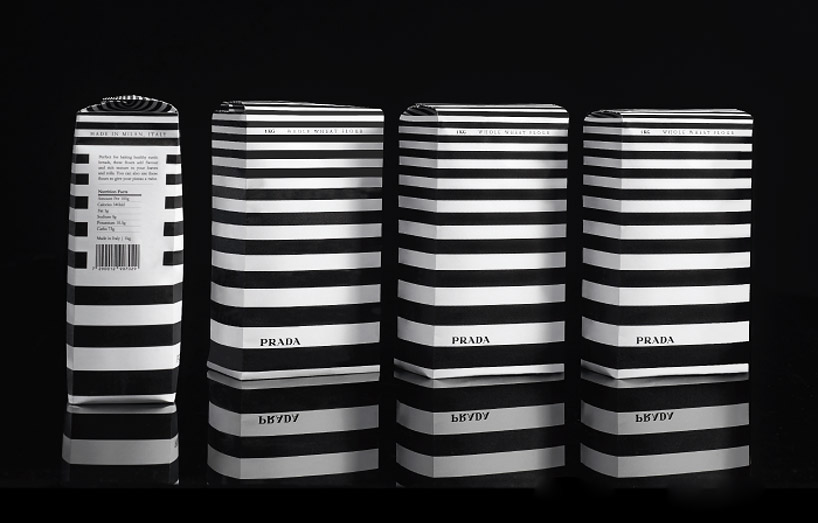
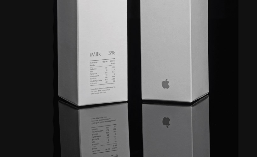
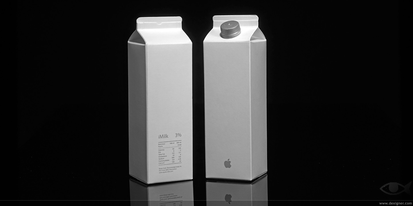
Peddy Mergui rebrands basic grocery products with designer label packaging with his “Wheat is Wheat is Wheat” project. The Israel-based artist puts an exaggerated spin on pantry staples to showcase the sometimes ridiculous link consumers attach between the aesthetic of the packaging to the items within it. Per Mergui, “the various exhibits combine shapes and images from the world of consumption with concepts from the field of consumer ethics…they serve to highlight both the contentious, potentially arbitrary connection that products have to packaging, and the ethically challenging conditions in which designers are asked to operate. wheat is wheat is wheat will leave you with more questions than answers – particularly on your next trip to the supermarket.” Each container’s design and colors are characteristic of its designer such as the vibrant hues of Versace and Tiffany & Co’s signature robin egg blue shade. The San Francisco’s Museum of Craft and Design will feature Mergui’s new exhibit through June 15th.
To view another article about food packaged in a non-traditional way, try Hikaru Cho’s “It’s Not What It Seems.”

