Tasteless, Offensive and Funny Corporate Logo Fails
Would you buy clothing from a company branded by a cat’s ass spread? How do you fancy owning a satellite dish with a boner? No? Us neither. With all of the money giant corporations spend/waste you’d think they’d invest more time/money in making sure they’re logos don’t turn them into laughing stocks. Sometimes, the humiliation occurs on a global scale, such was the case with the London Olympic badge which resembled Lisa Simpson getting gold for giving head.
Arlington Pediatric Center
Not sure about you, but we would not bring our kids here for a checkup.
Catholic Church’s Archdiocesan Youth Commission
Good use of negative space, but bad choice of an image.
CatWear
We’re not sure if they’re using a lowercase “a” or an uppercase “A”. Either way we’re all staring at a cat’s ass.
Clinica Dental
We suggest to pass up the Nitrous.
A-Style
This logo looks more like D-Style to us.
Dick Clark Productions
Guess a logo using a visual pun for the company name is a clever one.
Doughboys
Pizza, salad, panini and pee pee?
Junior Jazz Dance Classes
Those are some big boobies — oh wait, those are children.
Kids Exchange
Proper spacing should always be used.
Kostelecke Uzeniny
Not a hard one to get. No pun intended.
Kudawara Pharmacy
The designers for the A-Style logo may have had a hand in this.
Locum
Locum is a Swedish property management company. Seriously.
Mama’s Baking
Baking what?
Mont-Sat
This satellite dish looks too happy.
The Office of Government Commercia (OGC)
They should’ve shifted their view before approving this logo.
Rising Sun Sushi
The company wanted the rising sun behind a Japanese tea house. They got this instead.
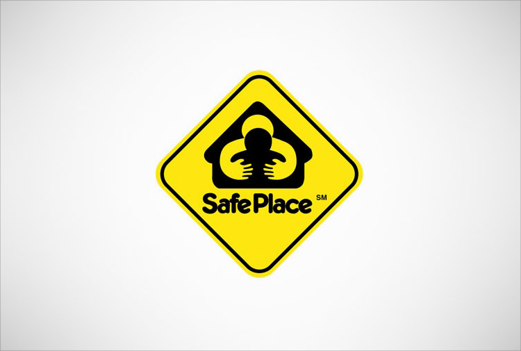
Safe Place
This logo fail seems more suited for Stranger Danger.
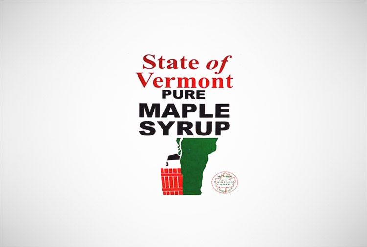
State of Vermont Pure Maple Syrup
With a logo like this, we’d say it’s okay to ask where their supply of syrup comes from.
The Computer Doctors
This company will make your computer work, but will not know how to fix a leaky genitalia.


